Congratulations to the winner of our logo contest!
March 13, 2015
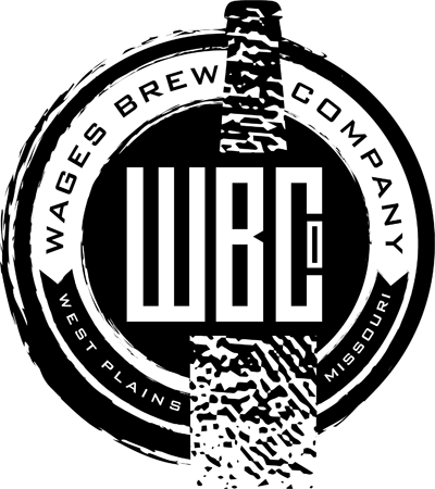
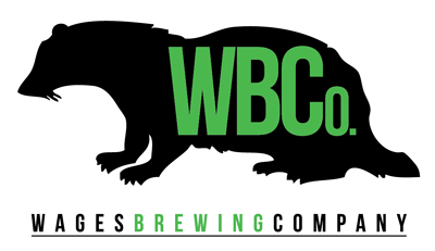
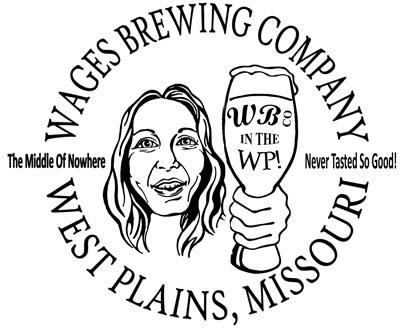
Houston, we have a winner
After many hours of over-thinking and back and forth, we have selected the
winning logo design as pictured above. This was NOT an easy task because so many
of you sent in excellent ideas. Indeed, our team of brewers, spouses, and
mentors could not unanimously agree! Enough with the hoopla! The winner is....
Dee Ann Lange of
Dog Gone Creative, LLC from
Kirkwood, Missouri! Not only is she incredibly talented, she was extremely
patient with Phil's demanding requests and re-requests (and re-re-requests!). We
love this design because it accomplishes everything we wanted: a distressed edge
to represent our own rough edges, a modern font that shows how contemporary we
are, and the fingerprint that shows we put our mark on our beers and on the
Ozarks.
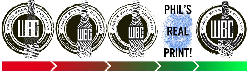
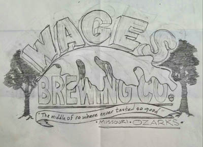
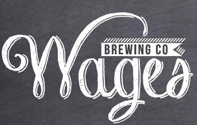
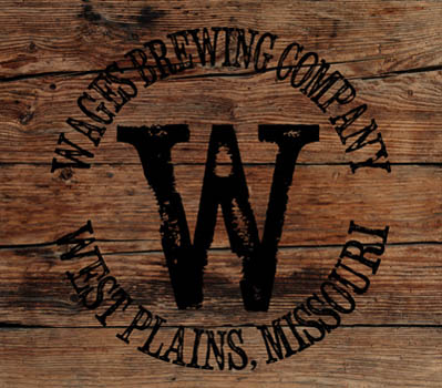
Here is a brief evolution of
the winning design:
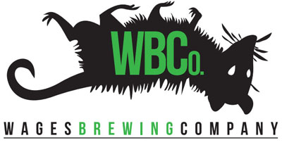
And here are more designs which Dee Ann submitted that
are equally amazing:
%20WBC%20octopus.jpg)
%20WBC%20letters%20%20(just%20one).jpg)
%20WBC%20cats%20on%20caps%20(just%20one).jpg)
%20WBC%20cats%20at%20center%20(just%20one).jpg)
Finally, Dee Ann received a membership package for her
winning design!
Honorable mentions
We said there were many wonderful submissions, and below are some of the ones
that we really liked and the names of the designers. Please note that some of
these are rough sketches, but we could see the diamonds inside, and we think you
will too. Some of you were worried that you didn't have the talent, but I think
the below proves that is far from the truth. Others told me they didn't have
good graphics software, but they did a fantastic job not even considering
the software they were using!
Without further ado, and in alphabetical order by
first name:
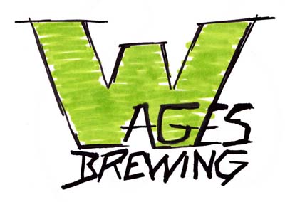
Allen Hampton
Allen submitted several wonderful and
intricate designs. This one excited us the most. I still have a soft spot in my
heart for the oak leaf.
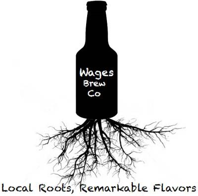
Ali Dexter
Not only did Ali come up with this cool
concept, she also submitted cool taglines. I suspect we'll see more of her
creativity in the future! I just loved this concept and her tag, "Local Roots,
Remarkable Flavors". I got to meet Ali in person because she wanted to go over
some ideas. I could tell she was onto more wonderful ones!
Brian Howell
I had the pleasure of meeting Brian in
person, and he's a nice guy with a wonderful sense of design (just look at what
he does for the Ozarks Horse Trader). He's a West Plains native, and has mad
design skills.
Bryan Shaner
Bryan - a tattoo artist at All For One
Tattoo out of Gray Summit, MO - submitted one of the first designs we received.
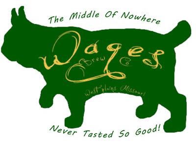
Daniel Bradshaw
Daniel of Birch Tree and I had several back
and forth messages for this design. We really like his "Wages" script as well as
the bobcat silhouette and the coloring.
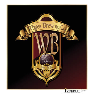
Jeremy Harrison of Imperial Graphics
Jeremy was kind enough to submit this
intricate design. If you need local printing or graphics work, you should check
out Imperial Graphics.
Tell him Phil sent ya!
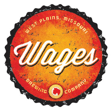
Jerry McCabe
Jerry is a professional graphics designer
out of St. Louis and happens to be Amber's cousin. He submitted several
variations of this design, and we liked this one the best because of the little
cougar head @ bottom center.
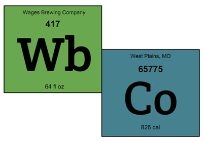
Jessica Nease
I really loved this design that Jessica
came up with. I can envision all sorts of ways to exploit this periodic table of
elements idea.
Michelle DeWitt of FreakyDeaky Designs
(X3!)
Michelle - of
FreakyDeakyDesigns
of Clever, Missouri - spent a lot of time working with us, and she sent a ton of
wonderful designs. She was a pleasure to work with: a true pro. Her chalk design
was among the top three of our choices (though we had some passionate voices for
the possum design!). These are just 3 of the ones we really liked.
Mike McHenry (also X3!)
Mike - of
Studio 1900 in Willow Springs
- submitted some really funny designs incorporating images of Phil and Amber. I
hope we can acquire his original art which we could display in the brewery. But
the third one (wood burned barrel) was in the top 3 of the designs we seriously
considered. Incidentally, I got to meet Mike at Brewfest last week, and he seems
like an awesome guy!
We like statistical informations
-
52 artists & graphic designers signed
up for our artist email list
-
20 of them submitted designs
-
Over 121 files containing probably 200
or more logos were submitted!
-
Around 24 designs tweaks were
requested
-
1 winner was selected
What's the
future hold for art contests?
So many things change from day to day, so I
can't make any promises. Caveat out of the way, I do believe we will have
beer label design contests in the future. I can not say when for it greatly
depends on when we need labels. That might be some time from now because we do
not intend to package our beer at first. Instead, we will run as a brewpub
serving all of our beer right from the brewery. In time, we will get kegs in and
around West Plains' restaurants, and then we'll bottle limited edition types of
beers (think: sours, barrel aged, barleywine, etc). But when the day comes that
we are ready to package cases of our standards (Whatknot, Good Mornin' Stout,
Landlocked IPA, and so on), we will be sure to get in contact with you all.
Until then, cheers!
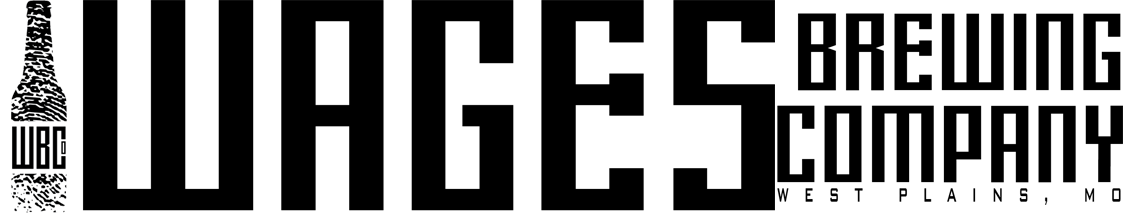
Phil Wages
Wages Brewing Company™
The middle of nowhere never tasted so good!™
The stuff below already happened...
A letter
from Phil
January 1, 2015
Thanks for your interest in our contest! I'm Phil Wages, founder of
Wages Brewing Company (opening in 2015 in West Plains, Missouri).
We are all about our local community, and we
have this idea in our heads that through friendly competition, we can
now and forever involve local artists in the designing of our logo and
future artwork. So we are reaching out to everyone in the Ozarks to
have our logo designed. I imagine this is a new endeavor for you; it
certainly is for us!
Our goal is to end up
with a symbol or emblem that is instantly recognizable, brand-like,
and simple. It must evoke the emotion of what WBCo is all about. Below
are full details about the contest including details of what we would
like, samples of things we do/don't like, and other inspiring remarks.
Beyond that sort of information, I want you to
know that we will be, first and foremost, the local
neighborhood brew pub. We will grow to make an enormous variety of
beers that are each unique and supremely different from one another
including everything from easy drinking yet flavorful beers to stouts
and IPAs to Belgians and sours. We'll seek to use as many local
ingredients as possible including experimenting with native and wild
grown ingredients (Morel Mushroom Brown? Persimmon Ale?). One a weekly
basis, there will be different beers to try as well as regulars that
are always available. In short, this is an artistic artisan endeavor.
We find inspiration for our beer and in our
lives anywhere, and for evoking your design, you should
too.
Obviously, there can be only one winner, but we
hope this works out well, and if so, we will have future contests as
we need more graphics including beer labels. Best of luck to all of
you!
Cheers
Phil Wages
P.S. I know there's a lot of information below.
But it really is worth at least one good read so that you are properly
focused on this wonderful project. And I know there will be a lot of
great submissions, and I believe you will find your edge hidden
inside my verbosity.
First Up, We Need a Logo
We've seen dozens upon dozens of ideas, but they aren't the right fit.
So we want local artists to "find" our logo and submit their ideas for
it. The more ideas, the better. We very much encourage initial rough
sketches and unrefined Photoshop graphics. We would love to receive a
large quantity of options and work our way to the one logo to rule
them all.
After February 1st, 2015, we will choose what we like best,
and the winning designer will receive a cash prize - depending on many
factors, in the range of $200 to $500 - as well as special artist membership
to the brewery. We'll announce on Facebook and via press release who
the winner is. Who knows? It may lead to fame and fortune! Or at least
a few local craft beers. ;)
If this works out for the
logo, then we will periodically have additional art competitions for
individual beer label art (such as Front Porch Porter, Landlocked IPA,
Good Mornin' Stout,
etc), and we'll have similar prizes to award to the artist we choose
for each label.
But let's not get ahead of ourselves! First, we need our logo!
What
We are Looking For
We want a simple symbol or emblem that evokes "Wages Brewing". Words that come
to mind include creative, hardworking, farming, organic, unique,
Ozarks, experimental, and fun. Our motto is "The middle of nowhere
never tasted so good!", and that perfectly explains what we're about.
We just need the logo that goes along with that. But we don't "just
need a logo". No no! We need something that is enduring, perhaps on
the verge of epic. Something that makes you think "That's just a
really cool logo. I would wear that/drink from that glass/want to buy
that hat/whatever." Something that people see on the shelf and it
makes them think "I have to try that beer!"
Our name does need to be included. Forms of our business name include
(but don't be limited by):
Wages Brewing Company
Wages Brewing Co
Wages Brew Co
WBCo
(NOTE: We won't use "WBC" because it reminds us of the "Westboro
Baptist Church", an association we can't have).
OPTIONAL: We would prefer to incorporate "West Plains, MO" somehow (though
we can add that ourselves if it doesn't fit within your design).
Useful Scribbles
We do NOT want a bunch of hops and grains in the design. If
you have an awesome idea with it, go ahead and submit it. Maybe we
are wrong! But we're just not feeling the hops/grains logo design.
It's too traditional.
We like the "slightly rough" or "worn" look,
but that is not a requirement.
Added 1/2/2015: Please, no dollar signs or
cash or coins. I know the play on "Wages" is totally a fun idea, but
we don't want to incorporate money into our logo as it sends the wrong
message.
Added 1/4/2015: Some things to think about:
*chalkboard
*rough, sketchy designs
*fun
And know this: We will sell upscale beers, but we are not hoity-toity.
We want people to look at our logo and think, "Man, this looks like a
fun place with exceptionally high quality beers!".
Added 1/4/2015: We've been asked about
colors. I'm not real beholden to anything specific. My personal
favorite colors are green and red. Amber loves purple. But I've read
that red and orange grab the eyes really well which is important.
Imagine going into a beer store and seeing 100 different bottles on
the shelf. How is the average person going to decide what to buy?
They'll have to go with what catches their eye, so I tend to think
about red and orange for that aspect. However, when we are branding
individual beers, we may choose to change the color scheme of the logo
based on the style of beer.
As
previously mentioned, we are first and foremost about being local.
The Ozarks is our home, and we want to keep the Ozarks as our most
important group of customers. If we can get beer to people further
away, great! But that's not our main goal.
I'm going to strongly encourage you to
submit as many samples as you can. We've already seen 30 or
more completely different designs from friends and professionals
already, and none have fully clicked with what we want. So please
submit as much as you can and want to. And remember that it doesn't
matter how refined it is.
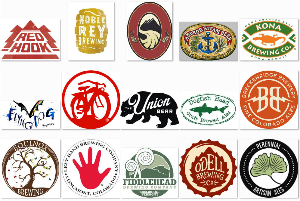
Here
is a group of logos we like, and we can send you more upon request:
Need Some More Guidance?
We don't want to stifle the creative spirit, so we're trying to leave
our guidelines somewhat vague, but if you need further info to spark
your creative genius, just let us know and we can give you more
insights, answer questions, and even give examples of what we do like.
Also, we don't want to be negative about other breweries' logos, so
we have not publicly posted designs we do not like, but we will send
them to you privately if you request it by email to [email protected].
Prizes
The prizes was cash and an Artist Brewery Membership. Email us for the
details.
Eligibility
Anyone aged 21 or older may enter. Employees and their immediate
families are not eligible to participate. Any individual U.S. citizen or
U.S.-based company may submit.
Submission Guidelines
Computer Files: Preferably,
very high resolution, like 12" x 12" and 300+ dpi, vector-based with
layers, between Photoshop 6 and CS4 or compatible. Ultimately, we need
something that can be printed and
scaled for really large print areas. The logo will be
used online, in print, on merchandise, etc. Flexibility is a key
requirement, including the need to resize easily (hence the need for a
vector-based graphic) and to look good in black and white as well as
color. Again, the final version of the logo will need to be suitable
for high quality printing.
If you can't provide a file
like that, please DO still participate! Remember this is why the
cash prize amount is between $200 and $500 (see above).
You can submit as many designs as you wish. Of
course, there can be only one winner!
You can submit designs at any time until the end of the competition
(2/1/2015). If you would like, I'd be happy to tell you if a design
won't win so that you can submit another (or several more!). We also
reserve the right to work with entrants on their designs upon
request or at our inclination. Why? Say we like something, but it
needs to be just a tad different to really be what we want.
After all, we must be sure we are getting the best logo possible.
You must submit at least one signed copy of the
signed disclaimer form. It can be printed out or scanned and
emailed (but it must have been signed).
How to Enter
You must submit at least one
signed disclaimer form for your design(s) to be considered.
Failure to do so will disqualify you from the contest.
You can submit art
and the
signed disclaimer form in any of these
ways:
-
sketches or completed original art
delivered in person (to set up a time, contact Phil or WBCo via
Facebook or email; sorry, we can't take calls due to daytime work
schedules, but you can supply your phone number and a good time to
call you back)
-
scan of art or digital design via
email to [email protected]
- via the regular mail to:
Wages Brewing Company
Attn: Logo
P.O. Box 155
West Plains, MO 65775
Do NOT send photographs unless the
intention is to convert your design into art or a digital design. In
the end, it must be artwork or a digital design.
Entries must conform to the Submission Guidelines
set out below. Entries which fail to do so may be rejected or if it is
the winning entry, the cash prize will be lower (see above "Prizes").
The deadline for
Entries is 11:59 PM CT (midnight) on February 1st, 2015.
We will attempt to acknowledge all entries within
one week of receipt; however, we cannot be responsible for entries or
responses lost in transit.
There
is no fee to enter.
Other Rules and Legal Small Print
In the event we want more than one of the designs submitted, the
cash prize may be divided up between them. We also may consider
picking "runner-ups", and we reserve the right to post our favorite
designs (winner and non-winner) via social media (including but not
limited to Facebook). We reserve the right to add a "contest
results" section on our website and social media, and if we display your design, we
will happily link to your website or Facebook page if you would
like.
We will announce the winner via press release to
social media and news sources as well as beer community sources. If you prefer
to remain anonymous, you can ask us to keep your name anonymous, and
we will respect that, but we think it would be good publicity for
you!
If your design is not selected as the winner or a
runner-up, we may still use it in the future at an unknown time. If
so, similar prizes of cash and membership will be awarded and of
course, that artist will be announced and recognized.
Added 1/4/2015: In the event we do not
receive a design we want to go with, no winner will be selected, or
we may offer a consolation prize to the best design, even if we
choose to continue looking for our logo. That is, we reserve the
right to only pick a winner if we find the logo we really want to
use.
This page was written and distributed on January
1st, 2015. In the event we need to add to or amend this page, we
will make note of changes such as "Added 1/4/15" followed by
the addition, and we will notify entrants by email of any
significant changes. If you are not already on our artists email
list, please send an email to [email protected] and we will add
you. We will not be responsible if you do not see any amendments to
this page.
See the
signed disclaimer form for legal small print and be sure to
fill out the form and sign it and get that to us along with your
submission(s)!